


As a UI-UX designer, there are many questions that I have not been able to answer to date.
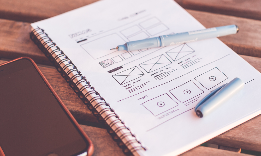
How to make a great application design?
Whether the design is good or not, the parameters are very diverse, there is convenience testing of course, but it has not been able to measure the goodness of the design. There are other boundaries besides functioning properly, such as beautiful visuals, more practical use. The taste, education level, income, and lifestyle of the user, which are summarized in persona, are the things that really influence it. It’s impossible to please everyone, good for you is not necessarily good for other users. But most often there aren’t multiple levels of application design.
1. Function
The first level of an interface design, it works fine. Of course. The point is, all elements are able to carry out their functions properly, according to commonly used rules. So that users can operate it out of habit. Usually, the design uses the default design (format) from the original stage. Android uses Material Plan, iOS uses Apple UI plan according to the guidelines.
The interaction is carried out with the standard of the manufacturer, all functions work, then it is done. No doubt it makes many applications have a similar usage experience (if not exactly the same). No personalization, all done after function. Applications seem monotonous, only changing colors.
What is missing from this level is personalization. It is true that everything is functioning, well, but the similarities with the others cost him his life. Characterless.

2. Beautiful
The second level after function, excellence. The first impression should be seductive, then it’s up to the user.
Both function but there is added value from the element of art. Start personalizing, differentiating it from the others in terms of appearance. Processed in such a way as to be beautiful and beautiful.
There are several elements that make up a beautiful, functional quip UI design:
• Typography
The right letter. Fit in aesthetics and function. Not too big and not too small. Too small makes it hard to read, too big makes it stifling. Emphasis, which should be greater and which should be small. Bigger means more important, quip determines the eye following in drawing the reading direction. Equal and similar will lead to a break in the hierarchy.
The difference between computerized and printed media is so great, the rules for the two are certainly different. Some references to sizes and fonts for advanced media can be seen below:
As an introduction to a message, crucial letters play a role. Quip as an aesthetic object. Fluid negotiations are needed to form a coalition of both, function and aesthetics.
• Contrast
Rhythm composer, rhythm maker as well as atmosphere maker. Present to maintain the hierarchy. High contrast for attention-grabbing, certainly for action anglers. Conversely, low contrast shows things that are considered less important.
The order of contrast indicates the value level of each form and function element. More striking, of course, is what users expect to take action. Too bright dazzled the eyes, too dark weighed them down. The button is made in such a way as to appear, with the aim of the user doing the desired action.
The color game that looks simple but has a very large function and effect. Further understanding of contrast can be seen at
Proper application can save users time and effort. In the end, help users solve the problem.
• Balance
Balance in space. Breathing space, a resting zone for the eyes as well as determining the direction of reading. The wider the relief of the vision, the clearer what action is expected. Focus on goals. Minus, the longer the content, the wider space, the longer the loading screen. Especially in mobile phone applications. It takes extra carefulness to place the main components in the portion and save the supporting components to create space. Focus action.
Quip every laying must have a reason. Since the user’s action is always the result of sight, the placement of all elements must be continuous in a pattern. The reading pattern (examining design) of each existing visual element, ultimately the user takes action.

3. Personalization
Best level. At this level, the design is able to simplify, remain beautiful, and be able to add more value to each function. Interface design (UI) cannot be separated from experience design (UX). Both complement each other, depend on each other. If UI is a visible face, UX is its temperament, character, traits, or character. Both are connected to each other, the UI is “Real”, UX is “Unseen”.
Some of the cases below are examples.
1. Transportation applications
The user opens the app of course to order a ride.
- Usual: enter an address to tell the position.
- Good point: auto-identify location.
- Best: the system already knows the position, offering the purpose of user habits based on the pattern of time and place
With advances in technology, applications are able to pamper users, shorten work. Always be one step ahead for the goals the user is aiming for.
2. Ticket Sales Application
- Usual: one-way, manual location input
- Good: detects the location of the nearest airport
- Best: detect location, offer return tickets.
Personalization adds closeness to the user. Summarize wear time by capturing patterns. Not only visual matters, but design should also be able to bring an experience that makes it easier for users, quip must be able to bring business progress to the company.
Not only a matter of function, but personalization can also meet users in matters of appearance. Every detail of the function is always looking for additional values,
“What else can help users?”
There are always ways to add beneficial value to users. Even the smallest quip button animation effect gives the user a different experience. Moreover, it simplifies the work, simplifies the steps. The lighter the work, the shorter the stages, the more liked by the user.
But building a good product application design is not an easy matter. It takes time and effort. Like making a house, starting from the foundation to the tile. Starting from the MVP until it doesn’t stop innovating.
From just functioning, beautiful, to being able to provide personalization. It’s not just a designer’s work, but involves the whole team to contribute. Researchers, venture directors, designers, as well as item proprietors, work together to build applications to make it easier for users.
An endless work, there is always a possibility to change for the better. It doesn’t have to be completed one time, the three of them are like steps. One by one it was ridden for a definite purpose, user satisfaction.
Until then, when the user needs something, the first thing to remember, open, use, is your application.


